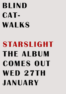
During this project I used a number of new media technology which expanded my knowledge and also helped me greatly.
For instance, Youtube was a massive asset at the beginning of the project when I was able to look at a wide variety of videos in order to decide what feel and style I wanted my video to have, I looked at videos from a range of artists from Blur to At The Drive-In. Something else which was essiental on helping me decide what sort of artists I wanted to use was Glogster, here I was able to make my tastes appear on screen as a sort of visual memo on the bands I wanted my band to be influenced from.
When it came to creating my poster and digi-pack I was extremely grateful to have access to Photoshop and this project allowed to hone my Photoshop skills and learn a lot more about the program. For instance, when designing my digi-pack, I had to crop, cut and saturate the images I used in order to get the look I wanted, and with saturating being something I previously knew nothing of I'm glad I'm now aware of how useful it can be. The same goes for the poster, I was able to use the eyedropper tool to get a certain colour from one image and use it for the text colour.
Finally, when it came to editing, iMovie became my new best friend. I was taught how to use the basic features of it and soon enough I was learning how to add effects and text which could possibly be used on my music video. iMovie allowed me to implement fast cuts, text and a range of other techniques which greatly improved my music video.
Wednesday, 31 March 2010
EVALUATION Question 3.
After screening my initial music video to an audience I was giving a number of helpful, constructive, criticism in order to improve the piece.
One point was that the video may be to short and could need something extra to prolong the screen time. This seemed logical to me and so I decided to include a 10 second segment at the start of the video which builds up to the start of the music, I found this helpful as it also gives the audience time to take in each member of the band as the segment is a longshot of the band entering a room and putting on their instruments before crashing into the song in a series of fast cuts.
Another point was that i needed more shots of the video diary footage included in the video as the cuts were not really fast enough and were not keeping up with the pace of the song. I totally agreed with this statement and so I filmed some more footage to include and make my video more interesting to watch.
EVALUATION Question 2.
2. My digipack and poster work well with my music video. I think they go together well as they keep up the image I was trying to promote with the band, down to earth, accessible. For instance, the poster, while plain, is eye catching and contains all the important information needed and there are no mainstream gimmicks used to get sales, enforcing the idependant approach the band have.
This is the same with the digipack, as mentioned earlier it was actually designed by a member of the band tieing in with the "do it yourself" attitude the band have reflective of the video diary segments included in their music video.
This is the same with the digipack, as mentioned earlier it was actually designed by a member of the band tieing in with the "do it yourself" attitude the band have reflective of the video diary segments included in their music video.
EVALUATION Question 1.
1. My music video challenges the forms and conventions of popular music by not making my artists objects of desire for the audience to feast on, for example 'The Pussycat Dolls'. Instead I have chosen to advertise my artists in a slightly artistic, contempory fashion while still promoting the members of the band to the audience. I have done this by essentially splitting my music video into two parts, one being performance, and the other being a narrative/insight into the band members. The performance part allows the audience to see how they perform and play together as a band while the other parts attempt to establish a connection from the screen to the audience. For instance, there are shots showing members of the band in a cafe, drinking tea, or just sitting down having a laugh and a joke, this is meant to convey a sort of video diary and inform the audience that the band are not some "higher than heaven" superstars.
Friday, 29 January 2010
Friday, 4 December 2009
Album Posters Analysis

In order to create a poster to advertise my band I figured I will have to look at other music promo posters to see what worked and looked good. The first poster I looked at was for Jay Z's album 'The Blueprint 3'. The poster is simple yet striking as the poster just contains the basic information of the artists name, album name, and release date, but seeing as its red writng on a black background it makes it very eye catching, and seeing as there is not a lot to take in, it's easy to remember the information. Because of all this, I quite like this poster I think its pretty effective.

The next poster I looked at was Sonya Kitchell. Her poster seems to convey a relaxing and elequent atmosphere reflective of her music, with it being a close up, black and white picture of her face. A bit like Jay-Z's poster all the information is in a simple, accessable text but this one contains a little more information like the record label and singles it contains. I do like this poster but I dont think it's mood would suit my band.

The final I poster (actually was a DVD) looked at was the well recognised 'Definitely Maybe' by Oasis. This cover contains the whole band in a slightly artistic pose/setting, portraying the style the band wish to give off. This probably my favourite out of the three and I would quite like to base my poster around this, quite a peculiar photo with a lot of mise en scene.
Friday, 27 November 2009
Digipack

This is my digipack for my bands upcoming album entitled 'Starslight' also the name of the single being released. The drummer from the band designed this album cover and he took it upon himself to make the cover have the most irrelvant attachments to the bands songs/song names. He came up with what you see now on the left, when asked what the ideas were behind this the drummer of BCW responded:
"So for a while now I've had this thing of like, making rhyming slang literal, you know? Like a forever long art project. And with these last few months what with the band really taking off, recording the album, getting ourselves out there and that, we've constantly been "cream crackered", you know, knackered. So I thought instead of relating the album cover to a lyric or a song I'll do it to a feeling we've all been having. It's just a middle-aged man falling asleep half way through eating some crackers, but the phrase is in there. It's like, subtle but not, and I think it's cool."
Subscribe to:
Comments (Atom)


